Role
Designer & Developer
Designer & Developer
Sector
Travel Tech (SaaS)
Travel Tech (SaaS)
Services
UX and Frontend Development
UX and Frontend Development
Impact
Saved thousands in budget dollars for various departments that would've otherwise been spent on expensive agency work.
Saved thousands in budget dollars for various departments that would've otherwise been spent on expensive agency work.
Streamlined the intake process with project owners, allowing the creative team to properly scope out work and meet deadlines more easily.
Established the first phase in developing an internal project management tool, replacing the need for signing a contract with an external vendor, saving $7k annually.
/01 Intro
Need
Sabre faced two critical challenges: 1) the need for a streamlined process to handle creative project requests more efficiently, and 2) reducing its dependency on external agency support for its creative projects, which was often expensive.
My Role
UX Design & Frontend Development
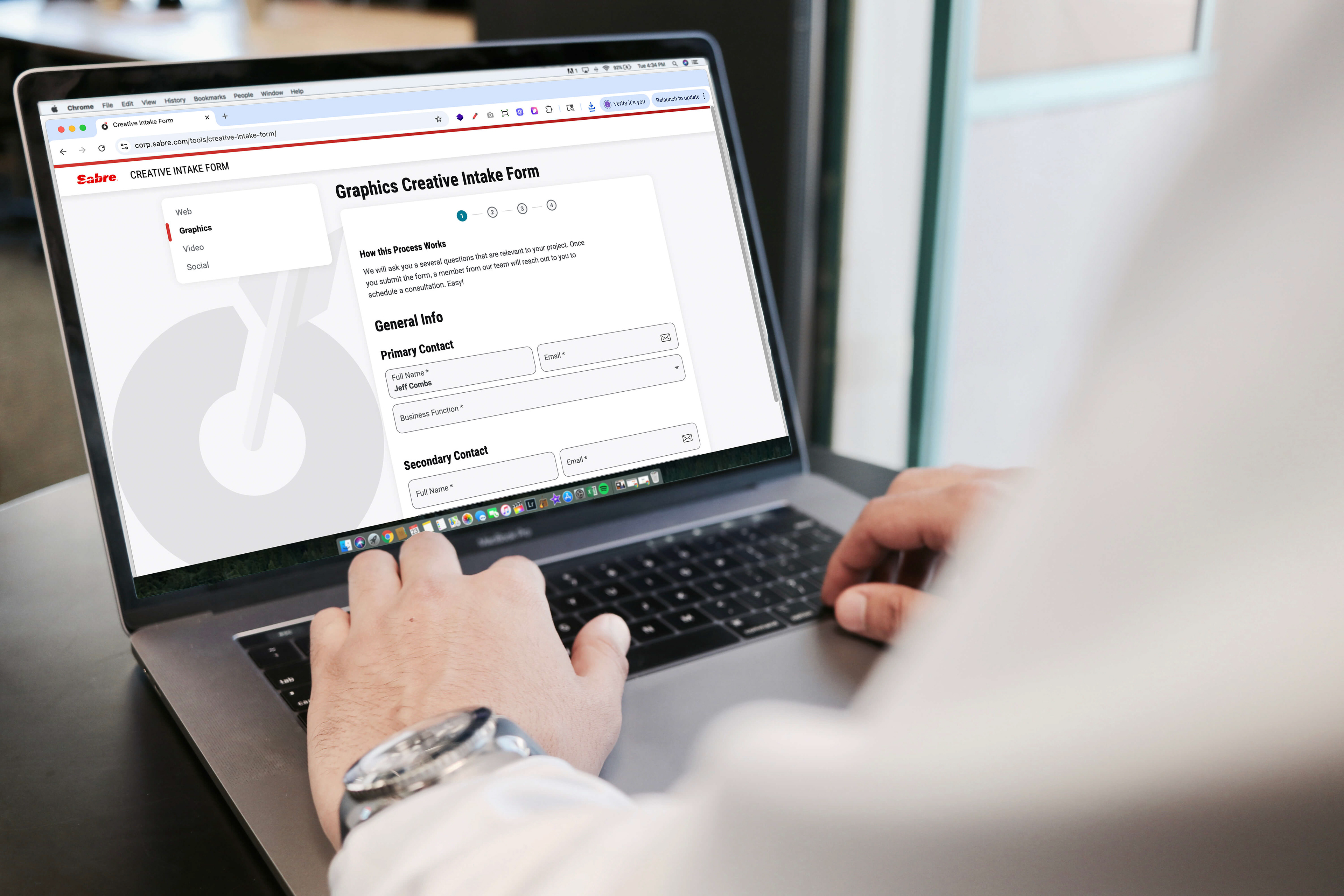
I fully owned the end-to-end completion of this project, working closely with all four departments of the Brand Studio Team to gather feedback and ensure the form was accurate and functional. Collaborating across teams, I made sure every detail aligned with our goals. I also partnered with the Principal Web Developer, who built a backend API to capture the data seamlessly. This ensured our collaborative efforts resulted in a smooth and efficient process that met the team's needs from every angle.
Project Overview
A revamped creative intake form would become a pivotal step in transforming the way the team manages its project intake.
This form didn’t just simplify requests—it laid the foundation for a more organized and effective project management system, setting the team up for success.
Tools
+ Figma for prototyping
+ React for the build
+ Next.js as the framework
+ Little State Machine for state management
+ React Hook Form as the form builder
+ Whimsical for user flows
+ React for the build
+ Next.js as the framework
+ Little State Machine for state management
+ React Hook Form as the form builder
+ Whimsical for user flows
/02 User Flow
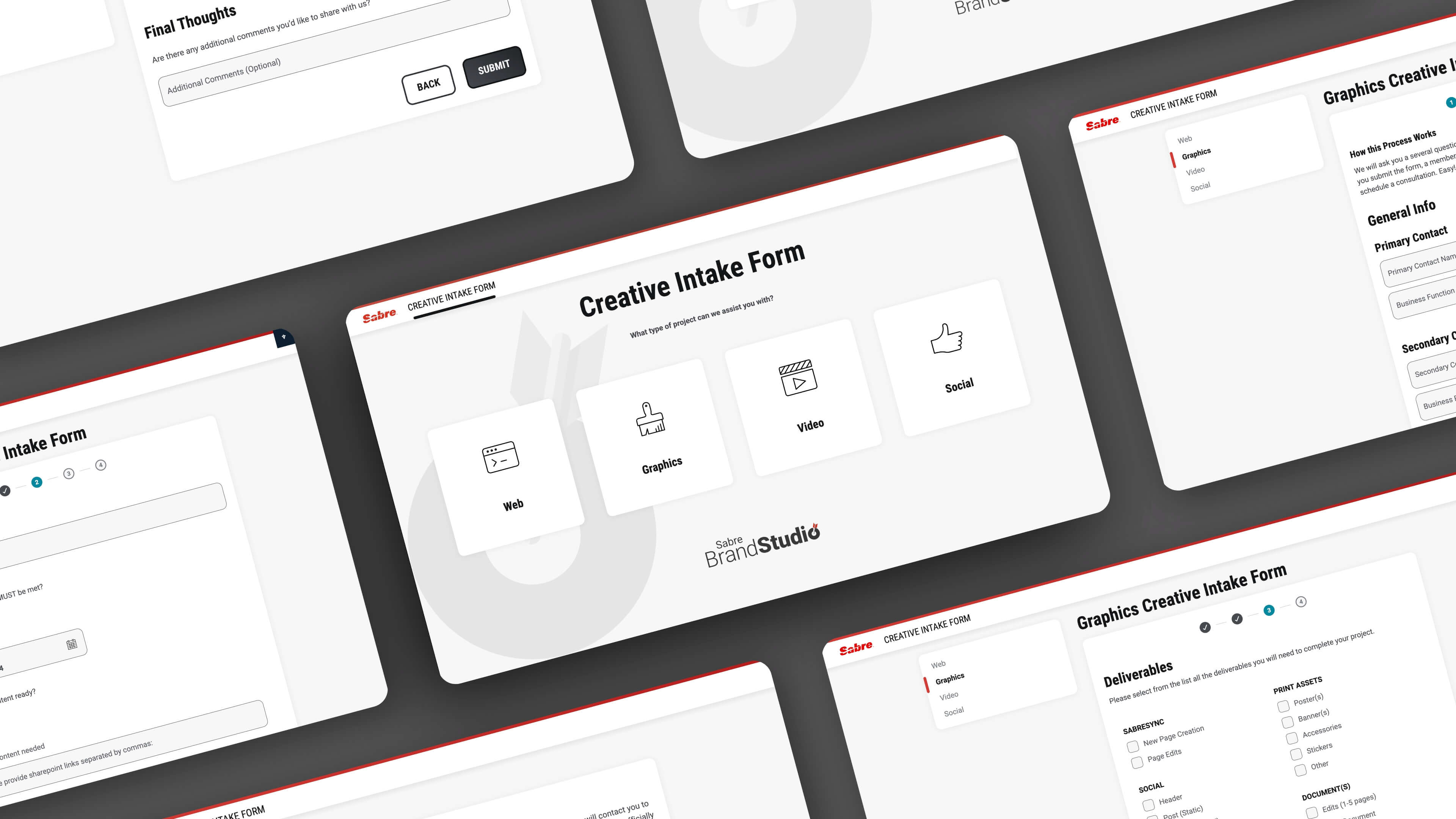
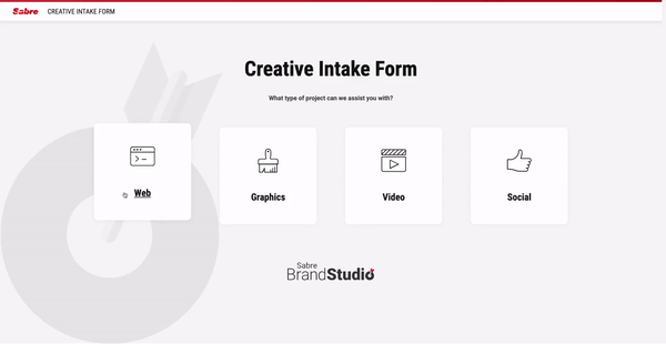
I collaborated with each department of Brand Studio to create four tailored user flows, one for each category, based on their form inputs. This process brought everyone into alignment on the form's structure and organization before I moved on to designing the mockups.

/03 Design & Build
Design
I leveraged Spark, Sabre's design system, to rapidly construct mockups of each form in Figma. This was the most efficient method for fine-tuning the design and flow of each form before production.
I leveraged Spark, Sabre's design system, to rapidly construct mockups of each form in Figma. This was the most efficient method for fine-tuning the design and flow of each form before production.
Build
I developed the system using Next.js React, which was a great learning experience since my background was in Angular. I had never used Next.js before this project, so while this build had a steep learning curve, I welcomed the opportunity to stretch myself.
I developed the system using Next.js React, which was a great learning experience since my background was in Angular. I had never used Next.js before this project, so while this build had a steep learning curve, I welcomed the opportunity to stretch myself.
One major goal I had for this build was to make it as fast as it could be with minimal load time. Multiple pages increase load time, and efficiency is the primary concern. After a few exploratory builds, I settled on a one-page structure that would give users four options. The type of form that would load would be based on their selection.
I structured the application using Next.js parallel routes so that each form's components were encapsulated within separate file trees without creating new routes. This was necessary as this iteration relied heavily on conditions and populating the form with components. This simple structure also made the build easy to understand for colleagues.
When a user clicked 'Next' for each step, the object state (Little State Machine) would be updated and stored for that session.
Upon submission, users received a confirmation email with a link to their job ticket, and the job ticket was automatically sent to the associated team. While the Principal Web Developer built the dashboard to manage submissions and email distribution, I was responsible for creating the email design.
Maintainance
The end product presented here is just the third iteration and first version of an evolving form, with ongoing improvements and fixes to meet the changing needs of both users and the Brand Studio Team.
The end product presented here is just the third iteration and first version of an evolving form, with ongoing improvements and fixes to meet the changing needs of both users and the Brand Studio Team.
/04 Challenges
Challenge #1
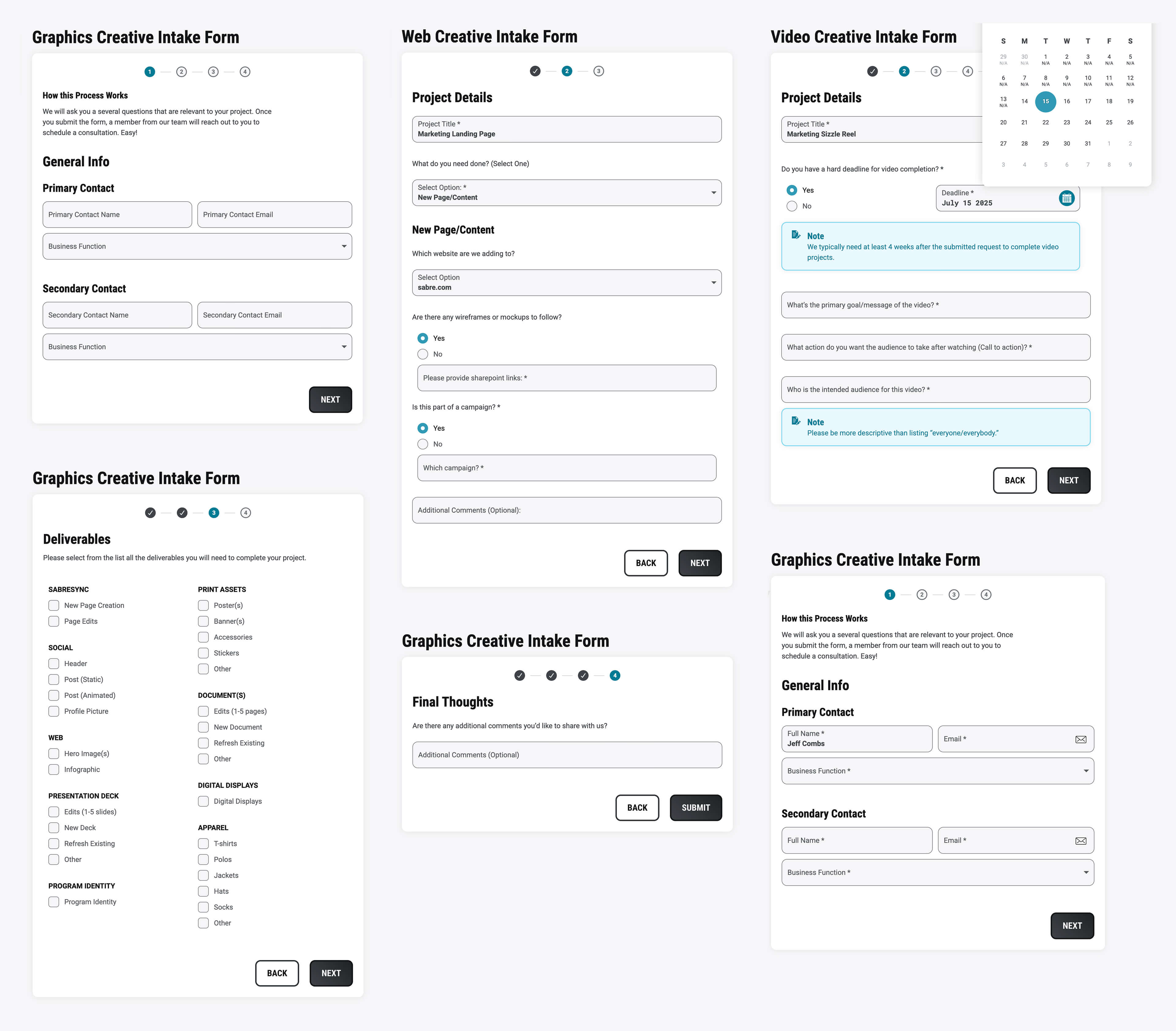
The previous intake form that I was redesigning was a single form with multiple steps to complete before a request could be submitted. This discouraged users from ever using the form. The Brand Studio Team had four different functions (e.g., web, graphics, video, social) with different needs, so a single form would not be one-size-fits-all without overwhelming users.
The previous intake form that I was redesigning was a single form with multiple steps to complete before a request could be submitted. This discouraged users from ever using the form. The Brand Studio Team had four different functions (e.g., web, graphics, video, social) with different needs, so a single form would not be one-size-fits-all without overwhelming users.
Solution:
The intake form was broken up into four separate forms: Web, Graphics, Video, and Social. Each form is customized based on the needs of each function. Users would select the type of project request at the beginning of the intake form, thus reducing the volume of inputs needed. This effectively streamlined the journey to submission, reducing the amount of time it takes users to complete a single request.
The intake form was broken up into four separate forms: Web, Graphics, Video, and Social. Each form is customized based on the needs of each function. Users would select the type of project request at the beginning of the intake form, thus reducing the volume of inputs needed. This effectively streamlined the journey to submission, reducing the amount of time it takes users to complete a single request.
Challenge #2
The form needed preventative measures to reduce the number of urgent requests and encourage users to work production time into their deadlines.
The form needed preventative measures to reduce the number of urgent requests and encourage users to work production time into their deadlines.
Solution:
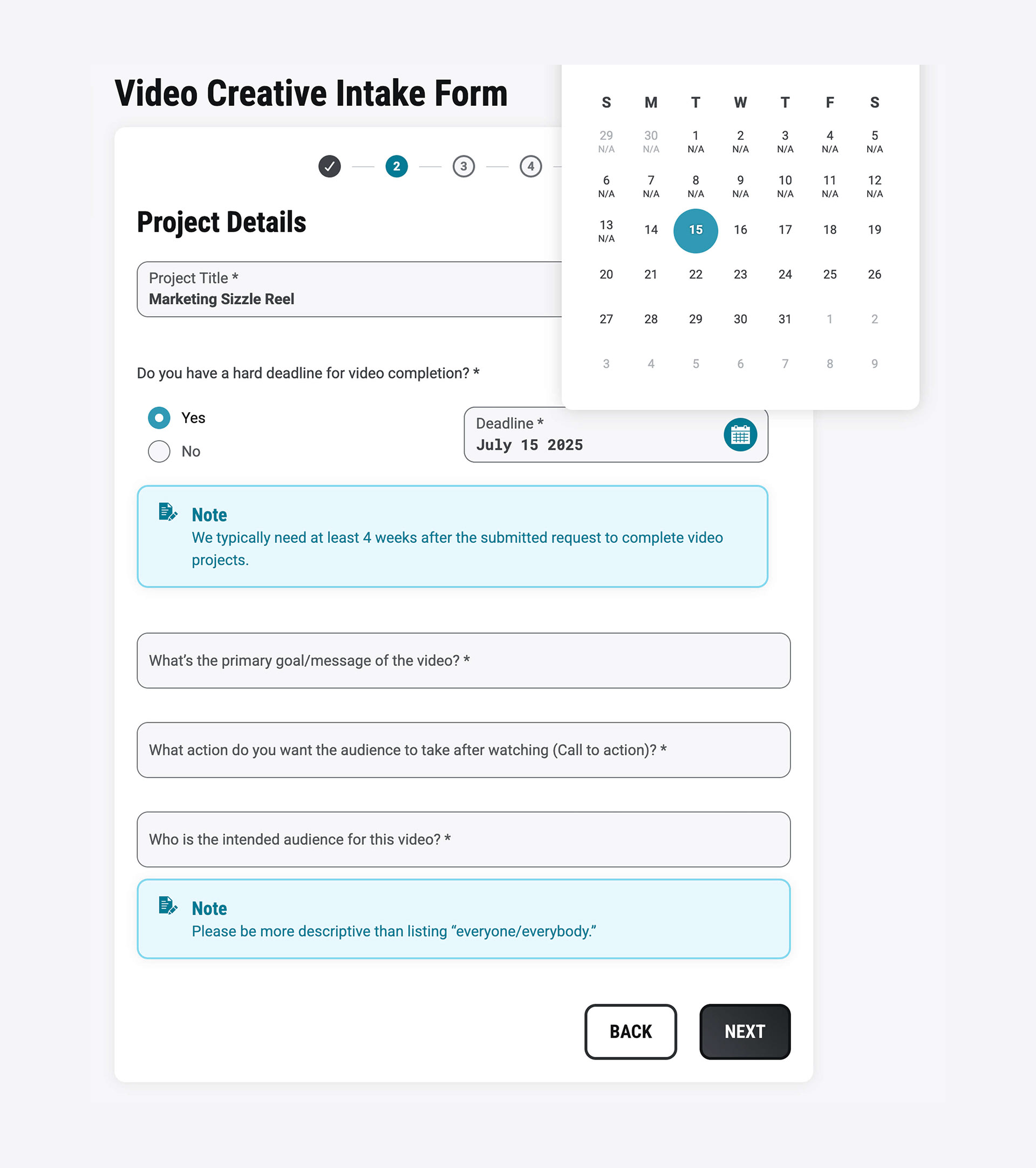
The Spark date-picker component was customized programmatically by adding an info block stating the minimum turnaround time. For dates that fell too soon, an 'N/A' would appear.
The Spark date-picker component was customized programmatically by adding an info block stating the minimum turnaround time. For dates that fell too soon, an 'N/A' would appear.
If a user selected a 'N/A' date, a conditional field would appear requiring an explanation for the urgent deadline. This step was implemented in hopes that project owners would scope in enough turnaround time for future projects.
/05 Quantifiable Difference
The new creative intake form, launched in October 2024, fundamentally improved the team's operations. We can now quantify its impact in three key areas:
Increased Stakeholder Engagement
Boosted Team Productivity
Enhanced Operational Capacity
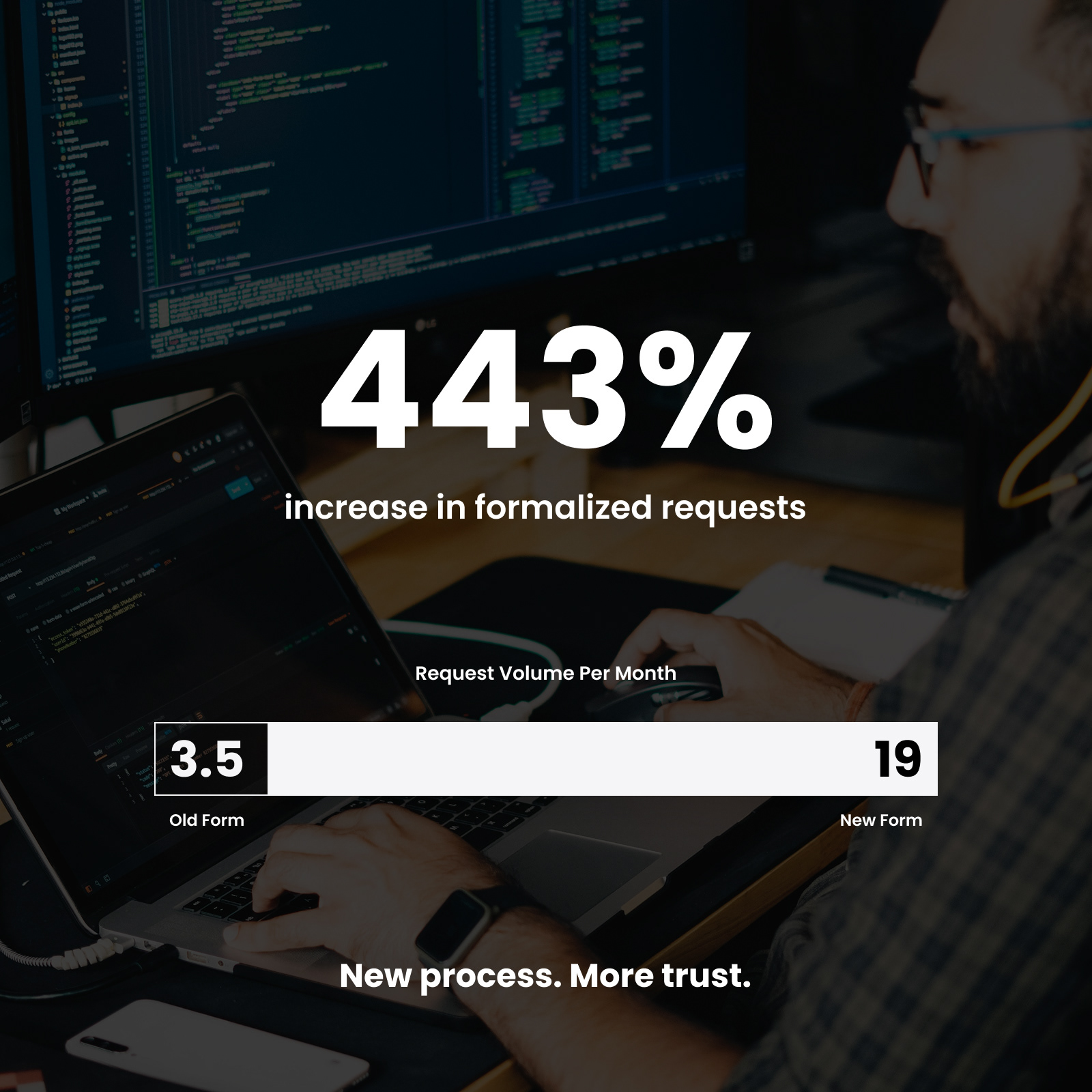
Web Team Snapshot
The following data demonstrates the web team’s efficiency gains, and it tells a very powerful story.
Data Timeframe: 8-month period
Increased Stakeholder Engagement
Web Team saw a 443% increase in the average number of monthly requests submitted through the official channel (from 3.5 to 19 per month).
This shows the new process is more effective and trusted across the organization.
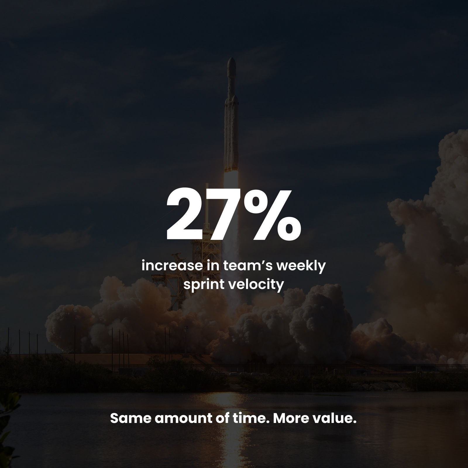
Boosted Team Productivity
By capturing all necessary information upfront, the web team eliminated significant communication delays. This is directly reflected in their sprint performance, where the team's velocity increased by 27% (from 37 to 47 points).
They are delivering more value in the same amount of time.
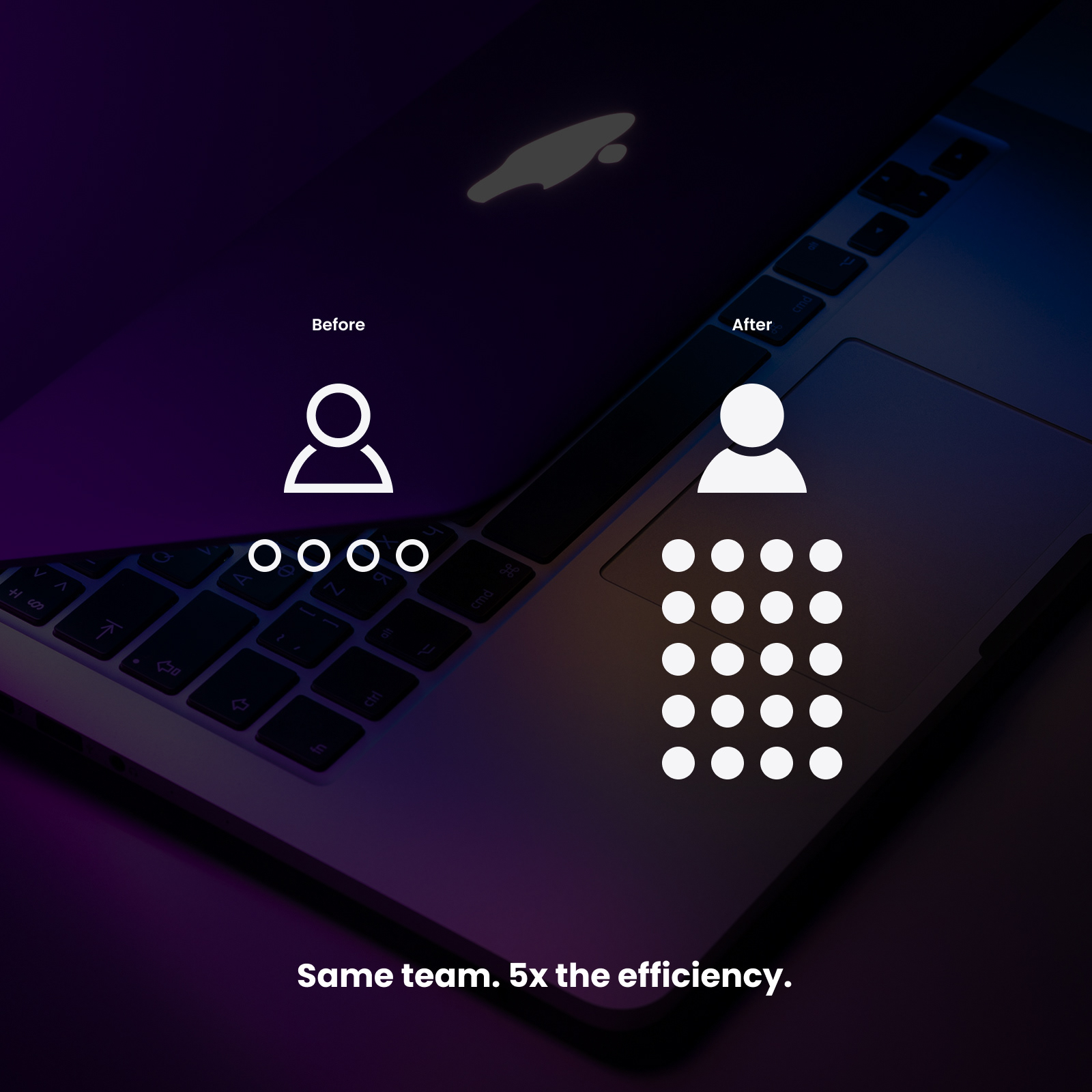
Enhanced Operational Capacity
The two-person web team was now equipped to handle a much larger workload, managing over five times the number of formal requests per person.
This represents a massive gain in efficiency and their ability to support the companys goals without additional resources.
/06 Conclusion
As a first version of the intake form, this was a major success. An influx of requests was the weekly result from the week of the form's launch.
Despite the success, there are clear ways to improve the form, such as building a proper dashboard with more controls beyond a simple list of submissions. From a development standpoint, there are ways of making this application leaner, but creating a viable product quickly as a first version was the main priority.
Most importantly, surveying users for feedback on the form would be invaluable information for future builds. This creative intake form is about helping people and saving bottom-line budget dollars by streamlining project intake and producing deliverables at an efficient and consistent rate.